In the lesson we brainstormed our ideas and thoughts for the future build.
Our main focus was to create a clean, welcoming, fresh environment for students to learn and feel fully comfortable in.
Another important part of this was to make sure the building was signed and able to be navigated with ease. The mood that we felt was right for this was a cool, clam, artistic mood.
Where colours would be very important, we were thinking pastel/bright colours (blues, greens, pinks).Natural light was also something we brought up, this to us was important because natural light produces a fresh feel and also makes moods lighter, where as artificial light dose not always light a room properly.
A main reason why we were attracted to BRIT was because of its uniqueness, in all areas. The BRIT for me provides a mature and professional working space, that allows student to be more independent and self motivated.
Developing Our Ideas;Research other performing art schools and universities.
Question-airs that can he handed to students, teachers and parents. Looking at art galleries. Looking at interesting designers for idea's and inspiration.
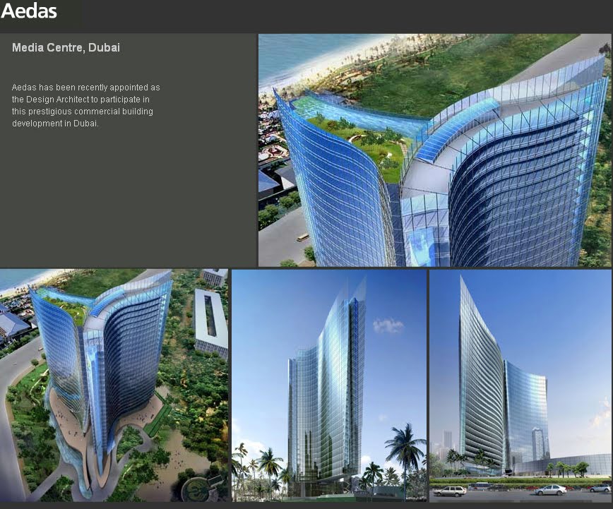
Questions For The Architect From Aedas.
- What are out limitations ?
- Are we focusing more with the exterior or interior designing?
- Is there anything we are not aloud to edit or plan?
- What was asked from him being the architect?
Notes From PowerPoint.
Branding is something to identify it by. How we can relate but yet make this build different to the other existing buildings, also making it a unique and positive environment.By making a mural, incorporate the existing logo.The BRIT's "future vision" is opening more new and extending existing opportunities for future students, to help prepare them for further education (university etc.) and work.
Bojan Stefanovic: Takes a main icon or part of the company and makes a simple but effective logo, using bright colours usually. Such as the Starbucks logo, which has been edited over a few years, its one of the most recognizable high street brands. The new logo has changed from a smaller sign and more writing to no writing at all and only the picture. This was able to be done because it is well known (writing is not needed) but as well, it will be more eco friendly because when going to other countries the writing will not have to be changed or edited, pictures are the same in every country but writing changes. They will also save money on printing and as pictures stay in peoples minds easier, the lack of writing will also insure more people remember Starbucks.
Uniliever Logo: The new Uniliever logo is much more friendly and interesting for the eye. Each little pattern within the "U" represents and different part of the company i.e. Lips represent looking and feeling good, The bee represents creation, pollination and hard work. They also changed the font of the writing under this, to make it more friendly they used a handwriting font.
Interior design and branding: Colours are associated with certain emotions and feelings. To make a space feel creative and imaginative, we bright, light and pastel colours (coral), and have furniture to make/accompany these colours.
South London Gallery: In this gallery there are huge spaces filling with natural light flooding in from massive windows either on the roof or instead of a wall, this makes the build eco friendly to save on energy lighting these spaces and also mix's outdoors with inside, by making sure some form of nature is able to be seen through the window or is painted on the wall above the window. Also to finish this off all the finishings are natural such as the wooden table and chairs.
University of Naples Metro Station: This station is a vibrant multi coloured pinball machine look alike metro station, this works for the station because its very different and did what the designer wanted it to do, he wanted to create a lively, futuristic, fun way of getting around. although this worked for him i feel this is the opposite to what the BRIT needs for there new build.
Ellipsis interior branding for Allgood: This was an interesting one that i liked, he had a lot a little handles printed all over the walls the create a bigger image when standing from a distance. Although the colouring of the walls and the prints on the wall are dull and boring colours it works because of the amount going on, on the walls. If it was to be multi coloured i feel it may have been too over the top and not a comfortable space to be in.
Churchill Museum: This build recently got refurbished, they did this easily by doing a pattern repeat in main areas to give a modern look, they also changed the furniture and the finishings.
Festival of Ideas, Downtown Manhattan: This was work done on the outside rather than on the inside, making a plan simple, boring box building interesting, with colourful objects outside. this helped me (when thinking about branding).
Way finding and Everyday Signs: Way finding is making it easier to get in, out and around the building, this will be even more important in this new building because no one will know where to go for what. We can tie this in with the re-branding of the building with use of colour. To me doing the signs for this build will be a great opportunity because it wont just be used for one floor it will be continued through out the building, I liked the idea of big pictures/symbols(girl/boy signs for the toilets). This is the best idea because like the Starbucks new sign, it has no writing to confuse people and it will prevent a big group of people standing around a big sign full of writing. Also make them bright to stand out and because this is the design block we can afford to do something different.
With the Less Ordinary Way Finding: I feel for a school this is too big but to a smaller scale its something BRIT could get away with doing.